Looking for some inspiration to spark your next design? Below we share our thoughts on user onboarding, feedback and empty states. In the coming weeks we’ll be sharing more on research, user testing, iteration in the design process and analytics, so stay tuned!
One of the most overlooked aspects of a mobile product is user onboarding, yet arguably one of the most important. It’s the first impression of your brand and product that new users will have. Onboarding doesn’t stop once a user finishes the first launch walkthrough, it continues and educates the user until they have ideally completed all actions that are associated with engagement and retention.
In order to create the most value for new users, three main points should be addressed:
- What need does the app fulfill?
- What does the app do?
- Why is it unique?
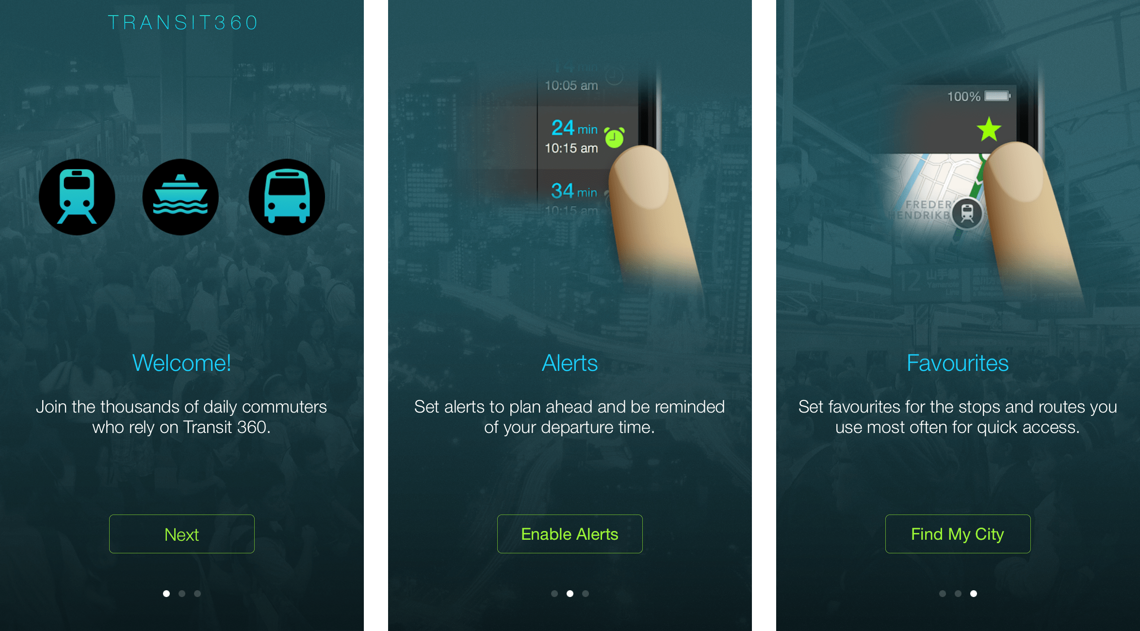
Recently we’ve been using the Hook Model when designing onboarding experiences. By doing so we not only reinforce specific behaviours but start the habit-forming usage we are looking for to generate retention.
It follows a simple approach, when people are searching for information or performing a task they should be rewarded and their behaviour should be reinforced in three ways:
- The Tribe – Social proof by showing people they are a part of something bigger than themselves.
- The Hunt – What information or experience are we giving users that they need or want?
- The Self – What is the unique value proposition we are offering? How will this product improve the user’s life.
The image below shows how we applied the Hook Model to our own onboarding in Transit 360.
Following the same idea as above, rewarding people and reinforcing when they complete an action is key to increasing their engagement. Imagine if you were never told “good job” for completing work or a task, you would probably stop doing it and find something else to do where people recognized your hard work. Feedback also acts as a communication mechanism to let users know if they’ve completed a task successfully or not.
Apple’s Mail for example is an application you may use daily that plays a “Woosh” sound as mail leaves your outbox and sends to your recipient, reinforcing that the action took place. Another example of UI feedback is the use of highlight states when a user taps a button to reinforce their action has taken place.
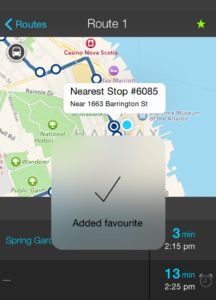
In Transit 360 we use a modal HUD to show confirmation and feedback that a favourite has been added. We also fill route and stop favourite icons to show at a glance if a route or stop has been added as a favourite.
We’ve all experienced this situation before when downloading a new app for the first time, especially social networking apps. The screenshots look great and the reviews are encouraging so you commit and download the app. Then once you get through onboarding (hopefully there was onboarding), you navigate to your profile to see it empty and bare with no instruction, data, or call to action on how to fill your profile. Other users of the app have profiles filled with photos and information about themselves and you start to wonder how you can update your profile too.
Empty states eliminate this problem because they are designed to educate the user on what they can do in this area of the app.
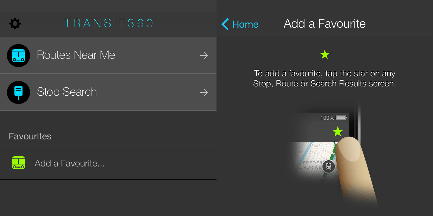
As mentioned before, Transit 360 offers commuters the ability to add favourite stops and routes. When they first download the app they don’t have any, but we know commuters who add favourites tend to use the app longer and find it more valuable. You’ll see from our homescreen that we provide a call to action and encourage new users to add favourites. When they tap on the call to action we educate them on how to add a favourite and show them every area in the app where they can add one.
 At MindSea the goal with every design is to give the end-user the most enjoyable, rewarding experience possible. This means going beyond just making a mobile app easy to use, it means the user should be delighted by the product. It makes their life easier, more efficient and more rewarding just by using it. It is the overall impression the app gives, not just the first time, but every time the user comes back to it. It solves a problem in their life, something that was missing before but is now filled. This is tough to get right, but what we strive for.
Stay tuned for another article we’ll be sharing in the coming weeks where we’ll discuss iteration in the design process, research, user testing and analytics.