Does app icon design actually matter?
Let’s break it down…
As of 2017, Android and iPhone users have more than 2.2 million apps to choose from in both Google Play Store and the Apple App Store. Over the years, we’ve contributed to this plethora of apps by bringing to life dating apps, proposal management apps, and many more on our journey to being named one of the top mobile app agencies in Canada. It’s been quite a ride, and along the way, we’ve learned many lessons about what goes into designing and launching a great mobile app.
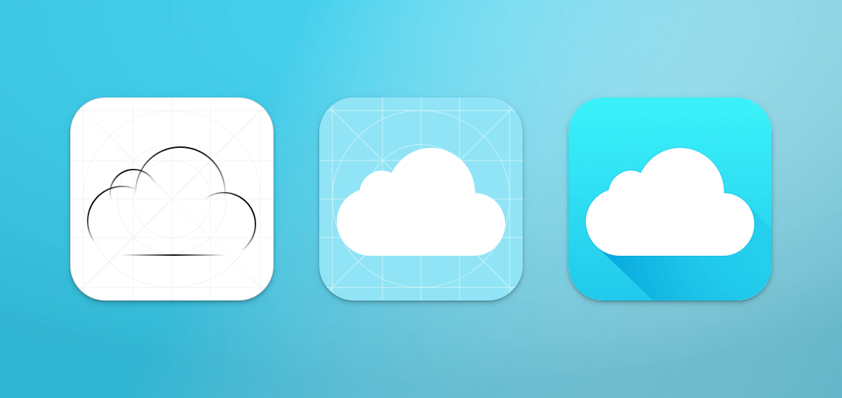
And one element of iOS design and Android design that doesn’t get nearly enough love is the design of the app icon—the small image that users tap to open the app.
We’ve designed and redesigned many app icons over the years, for our own projects (including Etchings) and for client apps like the SportsDay TALK app, which is used by thousands of Dallas-area sports fans daily.
Research On The Best Practices For App Icon Design
To better understand what goes into a great app icon, our team conducted new research surrounding app icon design.
In March 2017, we scraped the app icons for the top 50 mobile apps across some of the most popular categories in the Apple App Store. In particular, we looked at the top 50 apps in the Games, Food & Drink, Health & Fitness, Lifestyle, Music and Productivity categories. We then reviewed and analyzed the following key items:
- Primary Colour: Which colour makes up more than 60 percent of the icon’s design?
- Face: Does the icon depict a face or character?
- Text: Does the icon contain a logo or text?
Here’s what the data taught us about app icons and the current design standards:
Only Games Use Faces In Their App Icons
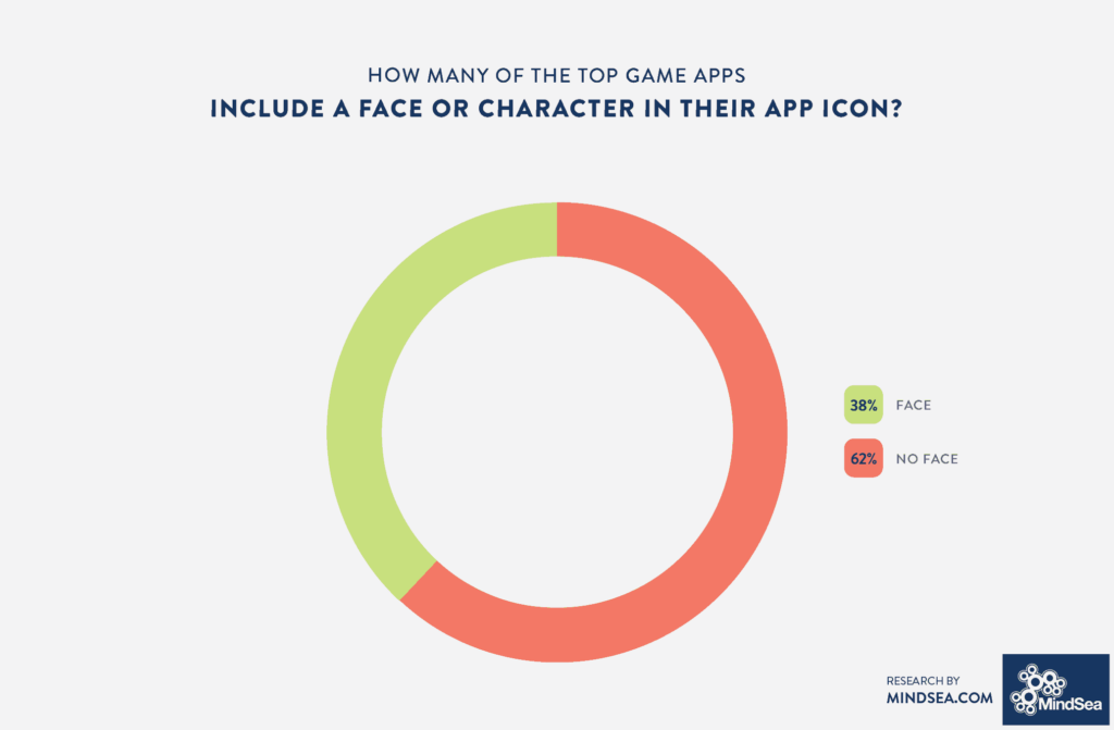
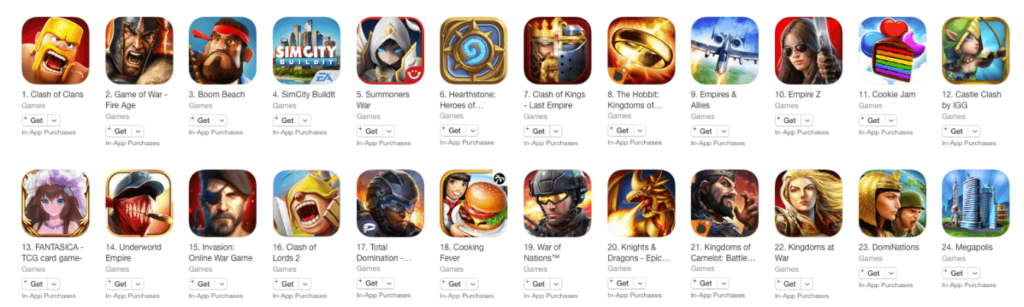
From the Simpsons to Angry Birds, the Games category is filled with characters. Our study found that 38 percent of the top gaming apps have faces in their icons. Some of these faces are human; others are animals or cartoons. At any time, you can be sure to find a handful of faces in the Top App section for Games:
The folks at Chartboost described this quite well in their interview with various game designers:
As a species, we’ve evolved to recognize faces and emotions to help us breed and survive. Even 7-month-old infants respond strongly to images of angry human faces. Using a face in an icon is a great way of generating instant impact and memorability
In the other app categories, faces are far from the norm—in fact, they are rarely found in the top 50 app icons outside of Games. Lifestyle and Food & Drink tied for second with only 6 percent of their icons containing a human, cartoon or animal face. Among the top 50 Music app icons, we found exactly zero that include a face.
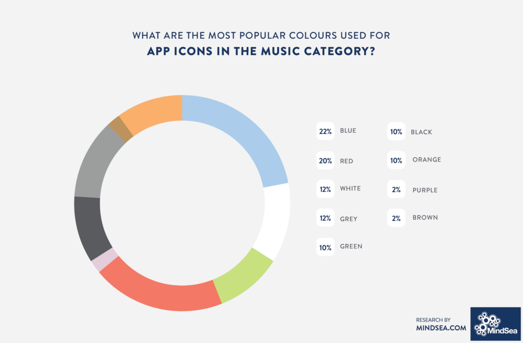
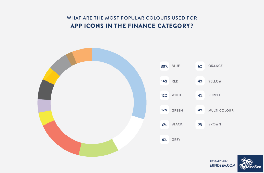
Blue Is The Most Popular Primary Colour For App Icons
From Facebook and Twitter to Ford and Visa: Blue is an iconic color that makes up thousands of logos. Our research found that the blue obsession continues in the world of mobile app icons—blue was the primary colour for 23 percent of the top mobile apps, followed by red and white, each with 13 percent.
Colour theorists say that blue suggests reliability, trust, honesty, loyalty and tranquility. White gives off an aura of goodness, safety, cleanliness and a modern aesthetic, while red represents energy, strength, vitality, love, fire, action, excitement, war and anger.
Red Is The Colour Of Choice For Food & Drink App Icons
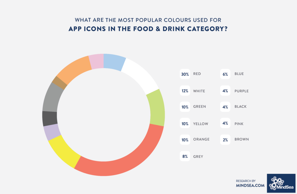
Blue takes a back seat when it comes to Food & Drink apps, making up just 6 percent of their icons. Instead, red is the clear choice—the color dominates 30 percent of the top 50 Food & Drink app icons. This makes perfect sense as in some studies, red has been identified as an appetite-stimulating color.
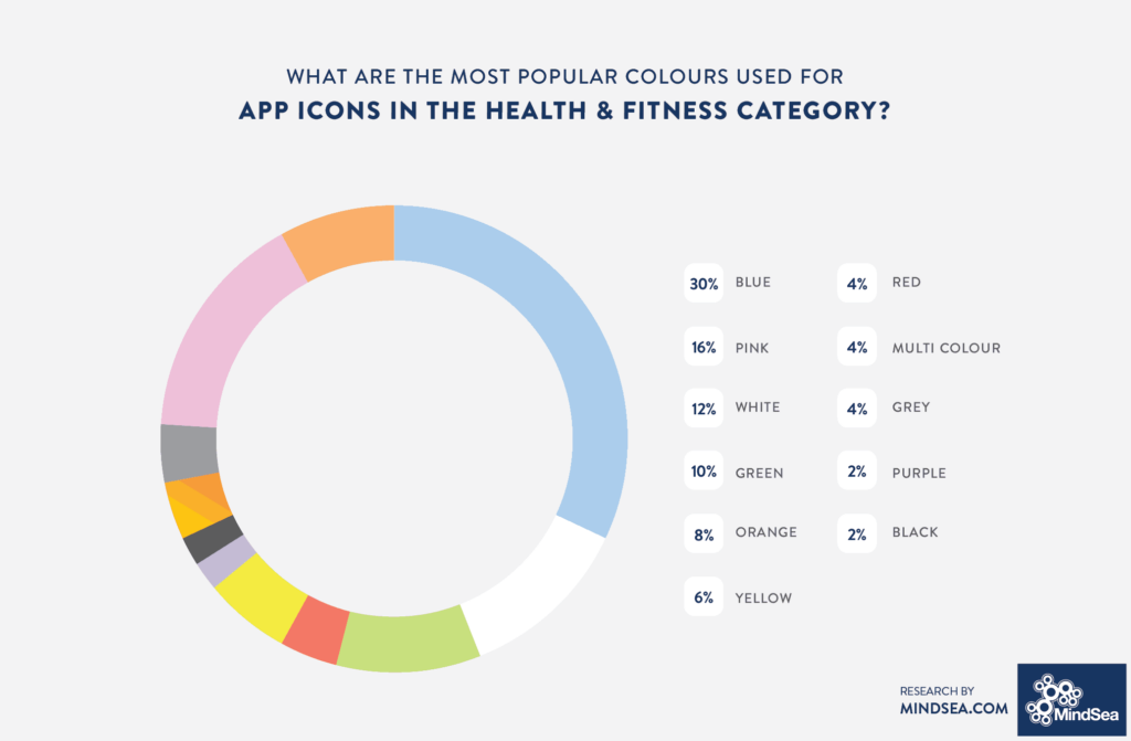
Surprisingly, even though red also represents strength, energy, and action, it was the primary colour for less than 5 percent of app icons in the Productivity and Health & Fitness categories.
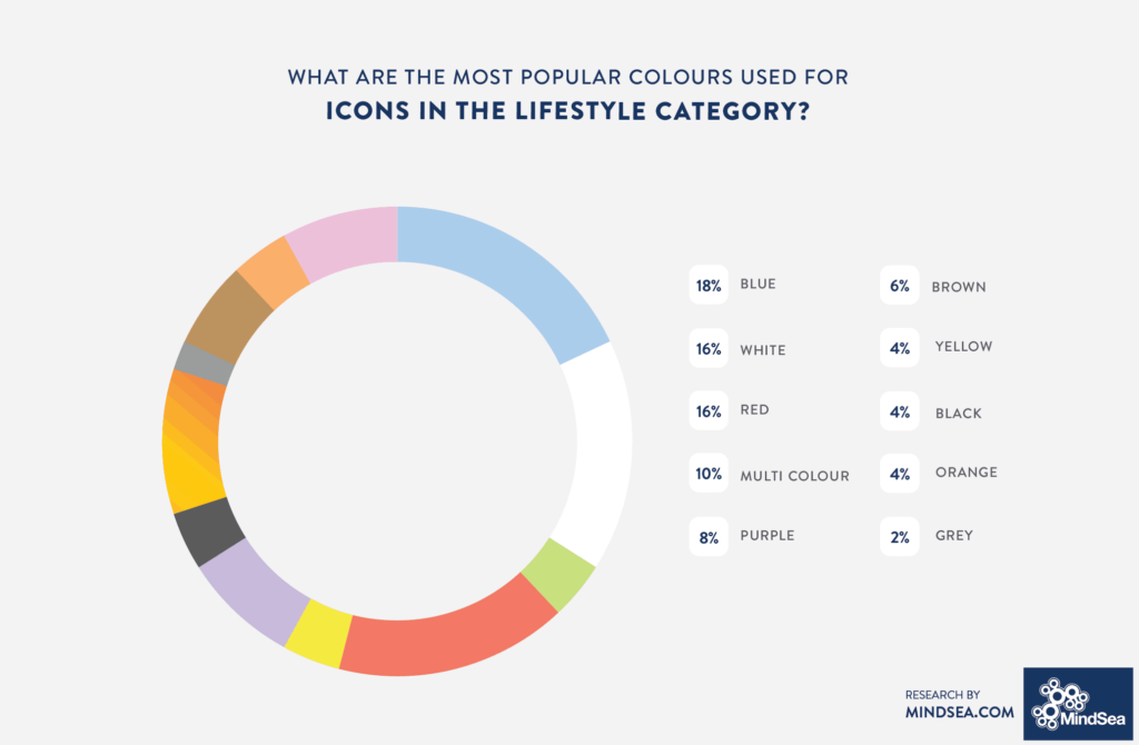
If you take a look at all the apps on your phone, there’s a very good chance that not a single icon is brown or purple. (Go ahead—try it!) In fact, our study found that only 6 percent of the top app icons use purple or brown as the primary colour:
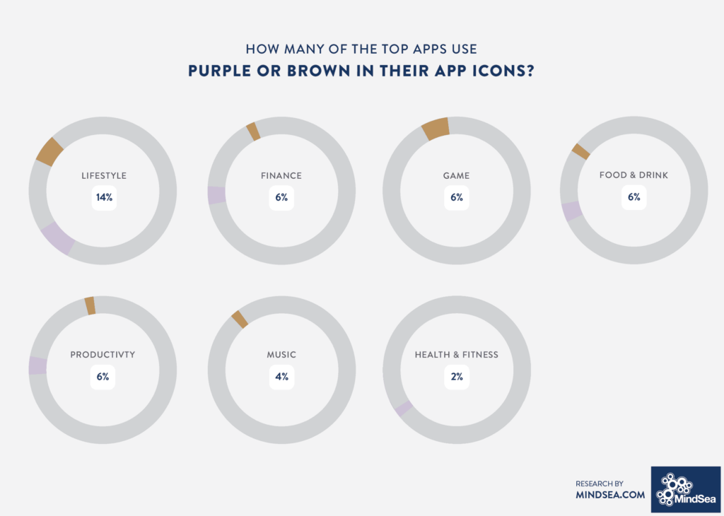
Interestingly, even though these apps have a colour scheme that isn’t popular in the app store, they have still generated millions of downloads.
Games Use A Diverse Range Of Colours For App Icons
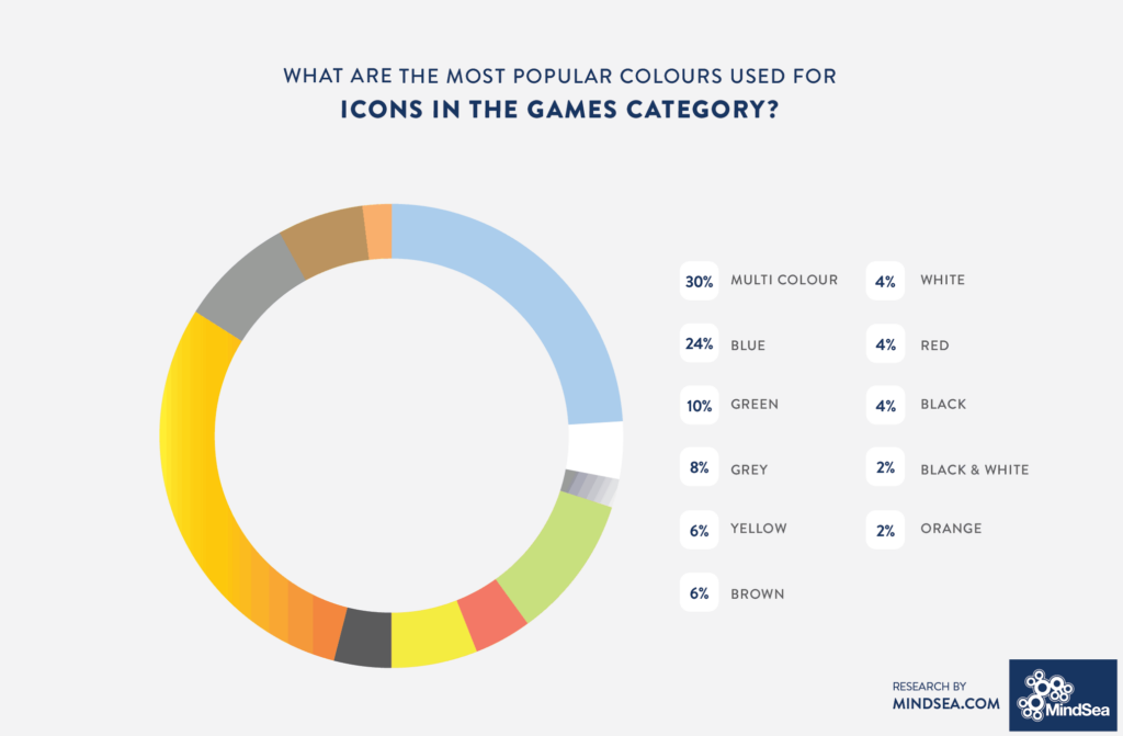
Out of all the categories, gaming apps are the most creative with their colour schemes. Thirty percent of the top app icons in the Games category have no clear dominant colour; instead, the icons showcase a scene, character or an abstract representation of the game.
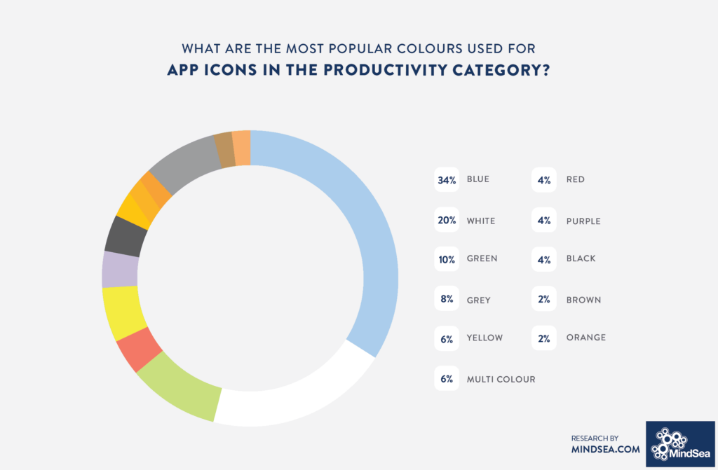
Here is the data from the other app categories:
If Apps Should Include Text In Their App Icons Is Up For Debate
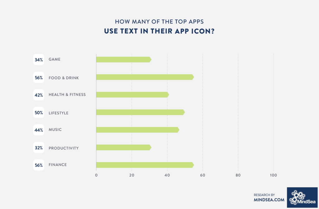
Across all categories, there is nearly a 50-50 split between app icons that have text and app icons that do not. This makes sense as the iOS Human Interface Guidelines recommend that apps only use words when they’re essential or part of a logo. Apple recommends that if your iPhone app icon design includes any text, it should be words that relate to the actual content the app offers.
Key Takeaways For Designing An App Icon
Understanding best practices of app icon design is an important step in creating an app icon that resonates with your audience, whether you’re designing it yourself or using an app design agency. You have to consider whether you want to fit in with the market by embracing the “rules” of colour and design—or break those rules and stand out from the crowd.
One key takeaway from this study is that even though most apps follow a certain pattern for their icons, there are outliers in every category. These outliers demonstrate the value of creating a product that people truly want and ensuring your app is easy to use, both of which are more important to users than whether your icon is blue or red.
For more advice on what it takes to find success in the world of mobile, check out our guide to planning, building and launching a great app.